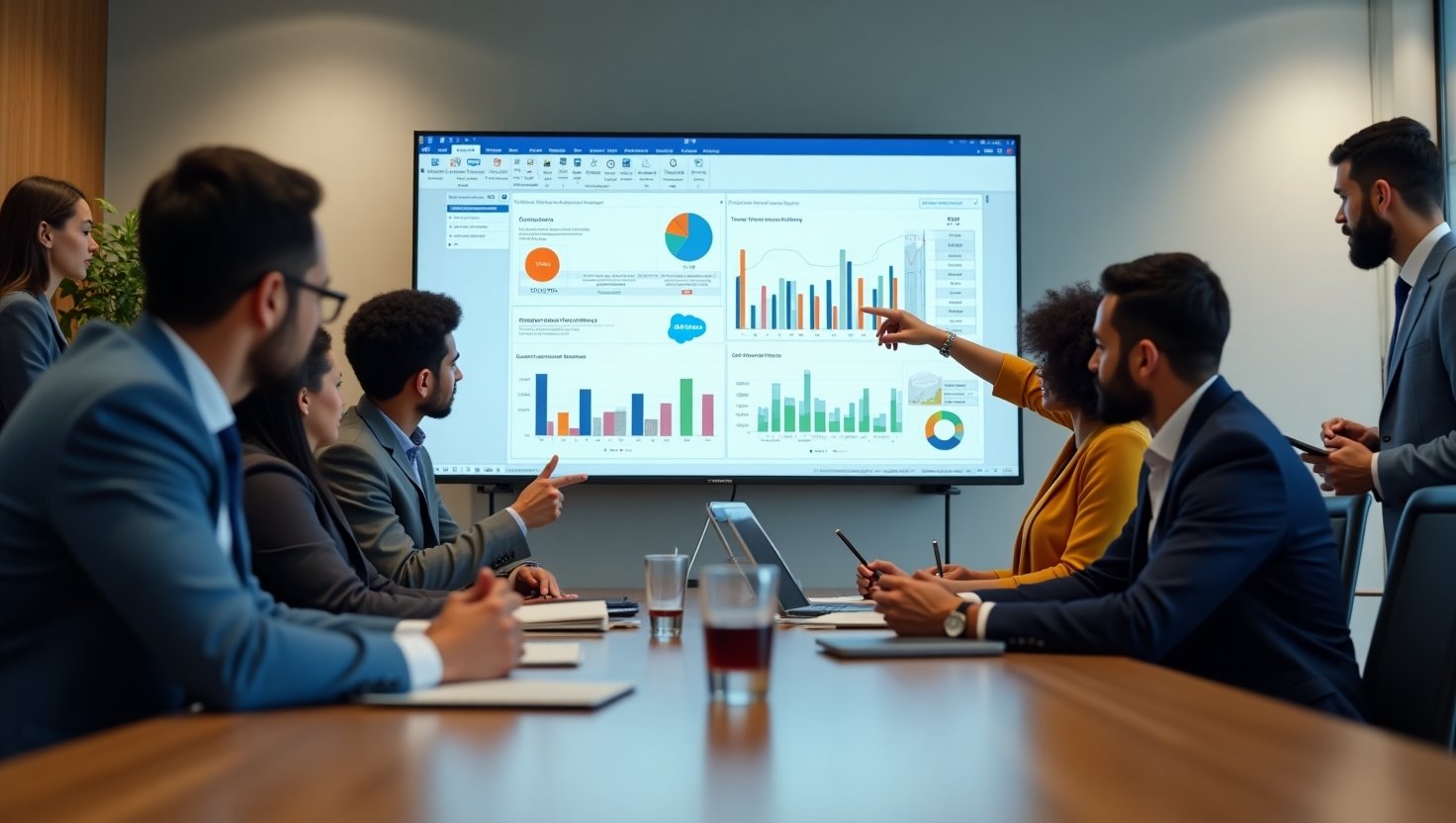
Walk onto any modern sales floor or into a support center, and you'll likely see them: large TV screens displaying colorful charts and climbing numbers. Salesforce dashboards, broadcast for all to see, have become a staple in data-forward companies. They are a constant, visible pulse of the business, showing leaderboards, closed deals, and open cases. But are they showing the full story?
Often, these dashboards present a simple, surface-level view of business activity. They show what is happening, but they rarely explain why it's happening or predict what might happen next. The data is all there, sitting within your Salesforce instance, but translating it into truly strategic insights on a shared screen requires a different approach. It requires moving from standard reporting to advanced analytics.
Why Put Salesforce Dashboards on a TV in the First Place?
Before we dig into advanced concepts, let's establish the foundational benefits of displaying Salesforce data on large screens. This practice isn't just about decoration; it’s a strategic decision that impacts culture and performance.
Fostering a Data-Driven Culture
When key performance indicators (KPIs) are constantly visible, they become part of the collective consciousness. Data is no longer confined to manager reports or individual logins; it becomes a shared language for the entire team. This ambient awareness encourages everyone, from sales reps to support agents, to think about their contribution in the context of the larger company goals.
Boosting Team Motivation and Competition
There's nothing quite like seeing your name climb a leaderboard in real-time or watching a celebratory graphic flash on screen after closing a major deal. Publicly displayed dashboards can create a powerful sense of recognition and friendly competition. This visibility acknowledges hard work and can inspire others to push a little harder, turning individual effort into a shared team momentum.
Improving Real-Time Decision-Making
Business moves fast. A problem that festers for a day can have significant consequences. Live dashboards provide an immediate feedback loop. A sudden spike in customer support cases or a dip in lead conversion rates can be spotted and addressed in minutes, not days. This allows teams to be proactive and agile, adjusting their strategies based on live information.
Enhancing Transparency and Alignment
When everyone is looking at the same numbers, there's no room for ambiguity. Sales, marketing, and service teams can see how their work impacts one another. This shared perspective breaks down departmental silos and aligns the entire organization around common objectives. Transparency builds trust and ensures everyone is pulling in the same direction.
The Limits of Standard Salesforce Dashboards
Standard Salesforce dashboards are a great starting point. They are relatively easy to set up and provide a decent overview of core metrics. However, for teams that want to operate at a higher level, these out-of-the-box dashboards have their limitations, especially when displayed on a shared TV.
Data Overload vs. Actionable Insight
A common mistake is cramming too many reports onto a single dashboard. The result is a cluttered screen filled with small charts and numbers that are impossible to understand from more than a few feet away. This "data vomit" creates noise, not clarity. An effective TV dashboard should present a few key metrics so clearly that their meaning is understood in a glance.
Static Snapshots vs. Dynamic Trends
Many dashboards show a snapshot in time: deals closed this month, cases open right now. This is useful, but it's historical. It tells you where you are, but not where you're going. Advanced analytics focuses on trends, velocity, and predictive indicators that provide a more forward-looking view of business health.
The Challenge of Cross-Object Reporting
Your most valuable insights often come from connecting data from different parts of your business. For example, how do leads from a specific marketing campaign convert into opportunities and, eventually, revenue? Creating these multi-touchpoint reports within Salesforce can be complex and often requires custom report types or more advanced tools to visualize effectively.
Moving to Advanced Analytics: What to Track and Why
To make your TV dashboards truly strategic, you need to focus on metrics that measure not just activity, but efficiency, momentum, and future potential. Here are some examples of advanced analytics you can track for different teams.
For Sales Teams: Beyond the Leaderboard
While leaderboards are motivating, they only show the final outcome. Advanced metrics help you understand the health of the entire sales process.
- Sales Velocity: This is arguably the most important metric for a sales organization. It measures how quickly deals are moving through your pipeline and generating revenue. The formula is:
Sales Velocity = ((Number of Opportunities x Average Deal Size x Win Rate)) / Length of Sales Cycle (in days)
Displaying sales velocity shows the team how changes in any of these four levers affect overall revenue speed. It encourages them to think about not just winning deals, but winning them efficiently. - Pipeline Coverage Ratio: This metric tells you if you have enough pipeline to hit your future quota. The formula is (Total Open Pipeline / Quota). A healthy ratio is typically 3x or 4x, meaning you have three or four dollars in the pipeline for every dollar of your quota. Visualizing this on a TV keeps the need for prospecting top-of-mind.
- Lead Response Time: In sales, speed matters. Tracking the average time it takes for a sales rep to follow up on a new lead can highlight process improvements. Display this metric by team or by individual to encourage prompt follow-up.
- Stage Conversion Rates: A sales funnel on a TV dashboard that shows the percentage of deals moving from one stage to the next is incredibly insightful. It immediately shows where deals are getting stuck, helping sales managers identify areas for coaching and training.
For Service and Support Teams: More Than Just Case Volume
A support dashboard shouldn't just be a list of open tickets. It should reflect the quality and efficiency of the service being provided.
- First Contact Resolution (FCR): What percentage of issues are solved during the very first interaction? A high FCR is a strong indicator of both customer satisfaction and agent expertise. Tracking this trend daily encourages thorough and effective support.
- Customer Satisfaction (CSAT) Scores: Don't let CSAT scores hide in reports. Pipe them directly from Salesforce to your TV dashboard. When an agent closes a case that results in a high score, celebrate it. When a low score comes in, it serves as an immediate prompt for a manager to follow up.
- Average Handle Time (AHT): How long does it take, on average, to resolve a customer's issue? While a lower AHT is generally better, tracking it alongside CSAT ensures that agents aren't sacrificing quality for speed.
For Marketing Teams: Connecting Efforts to Revenue
Marketing dashboards on TV screens help bridge the gap between marketing activities and sales outcomes.
- Lead Source Performance: Which channels are producing the leads that actually turn into customers? A simple bar chart showing closed-won revenue by lead source (e.g., Organic Search, Paid Ads, Events) makes it clear where the marketing budget is working hardest.
- Campaign Influence: Use Salesforce's campaign influence features to visualize all the marketing touchpoints that contributed to a closed deal. This helps show the value of activities that may not have been the final click but were important in the buyer's journey.
- MQL to SQL Conversion Rate: How many of the leads that marketing deems "qualified" are accepted by the sales team? Displaying this rate on a TV promotes accountability and encourages better alignment between the two departments on lead quality.
Designing Effective TV Dashboards for Advanced Analytics
What you show is important, but so is how you show it. Information on a TV screen is consumed differently than on a desktop. It needs to be understood from a distance and in a matter of seconds.
The 5-Second Rule: Can You Understand It at a Glance?
The golden rule for any TV dashboard is simplicity. If you can't understand the key takeaway in five seconds, the dashboard is too complicated. Use large font sizes, big number visualizations, and simple gauges or bar charts. Avoid data tables and complex, multi-axis line charts.
Tell a Story with Your Data
Arrange your dashboard components in a logical narrative. For a sales dashboard, you might show the funnel from left to right: new leads coming in, the value of the open pipeline in the middle, and closed-won deals on the right. This visual flow makes the data easier to process.
Use Color and Conditional Formatting Wisely
Color is a powerful tool for conveying meaning quickly. Use a simple color scheme. Green indicates you are meeting or exceeding a goal. Red indicates you are falling behind. Yellow can show you're approaching a target. This instant visual cue communicates status without requiring someone to read the underlying numbers.
Rotate Your Dashboards for Comprehensive Views
You don't need to fit everything on one screen. A great feature of modern digital signage systems is the ability to create a playlist of dashboards that rotate on a timer. You could cycle between a high-level sales overview, a deep dive into pipeline health, and a customer service scorecard. This keeps the content fresh and allows you to share a wider range of information without creating clutter.
The Technology: How to Securely Display Salesforce Dashboards on Any TV
Once you've designed the perfect dashboard, you need a reliable and secure way to get it onto your screens. Many companies start with the seemingly simple solution of hooking a computer to a TV and leaving a browser logged into Salesforce. This approach is filled with problems.
The Problem with Simple Screen Mirroring
Leaving a Salesforce account logged in on an unattended computer is a significant security risk. It also presents practical challenges: browser windows crash, computers need to restart for updates, and there is no way to manage the content remotely. It's an unstable solution that is not built for continuous, reliable display.
The Solution: A Secure Digital Signage Platform
The proper way to display sensitive information from platforms like Salesforce is with a secure digital signage solution. Platforms like RocketScreens are built for this exact purpose. They provide a secure, read-only connection directly to your applications, giving you complete control over what is displayed.
With a native Salesforce integration, you don't need to worry about saving user credentials or leaving a browser logged in. The connection is made through a secure, authorized API. This means you can select the exact reports and dashboards you want to show and push them to any screen, anywhere, all managed from a central platform.
This approach not only solves the security issue but also adds immense flexibility. You can blend your Salesforce data with information from over 100 other apps. Imagine a screen that shows your sales pipeline from Salesforce next to your top-performing social media posts and a welcome message for a new hire. This is how you create a truly dynamic and informative communication channel. Furthermore, you can schedule different dashboards to appear at different times, perfectly aligning with the dashboard rotation strategy mentioned earlier.
Real-World Examples: How Teams Are Using Advanced Dashboards
Let's look at how this comes together in practice.
The Competitive Sales Floor
A tech company displays a sales velocity dashboard on a large screen in the middle of the sales floor. Reps can see in real-time how their activities—making calls, sending emails, moving opportunities to the next stage—impact the team's overall velocity. The number ticks up with every positive action, creating a constant, motivating feedback loop and sparking healthy competition around efficiency, not just final numbers.
The Proactive Support Center
A national retail brand has a support center with screens showing a live CSAT score next to the First Contact Resolution rate. When the team successfully resolves a complex issue on the first call and the CSAT score trends up, a celebratory animation appears. If CSAT dips, it's an immediate, all-hands signal to focus on improving the customer experience.
The Aligned Executive Team
In an executive suite, a screen silently rotates through three key dashboards every 60 seconds. The first shows high-level sales KPIs. The second displays marketing campaign ROI and MQL-to-SQL conversion. The third shows customer service health scores. Any executive walking by gets a complete, 360-degree view of business performance in minutes, ensuring everyone is aligned on priorities.
Your Salesforce data is one of your company's most valuable assets. Putting it on a TV screen can move it from a passive report to an active driver of performance. By focusing on advanced, predictive metrics and designing your dashboards for clarity and immediate impact, you can turn your screens into a central force for motivation, transparency, and smarter business decisions.
Ready to put your Salesforce data to work on your screens? Explore how a secure digital signage solution can connect you to the insights that matter most.