Human Resources departments are the guardians of a company's most valuable asset: its people. With this responsibility comes an immense amount of data. From recruitment pipelines and employee satisfaction scores to turnover rates and compensation benchmarks, HR teams are sitting on a treasure trove of information. The challenge has always been to move beyond simple data collection and turn that information into clear, actionable insights that drive strategic decisions.
For years, spreadsheets and static presentations were the standard. While functional, they are often cumbersome, quickly become outdated, and fail to show the dynamic relationships within the data. This is where a new approach is needed—one that brings HR data to life.
This guide explores how to use Microsoft Power BI to create meaningful reports for your Human Resources department. We will walk through the essential dashboards every HR team should consider building. Most importantly, we'll show you how to solve the "last-mile" problem: getting these critical insights off your laptop and in front of the people who need to see them, from the C-suite to the factory floor, using digital signage.
Why HR Needs to Move Beyond Spreadsheets
Traditional reporting methods for HR have clear limitations. Manual data entry is prone to errors, consolidating information from different sources (like your HRIS, ATS, and survey tools) is a time-consuming chore, and by the time a report is compiled, the data may no longer be relevant.
A data-driven HR strategy requires tools that can:
- Integrate multiple data sources seamlessly.
- Update in real-time to reflect the current state of the workforce.
- Provide interactive visualizations that allow leaders to explore data and ask follow-up questions.
- Identify trends and patterns that might otherwise go unnoticed.
This is precisely what Power BI was designed for.
What is Power BI and How Does It Help HR?
Microsoft Power BI is a business analytics service that provides interactive visualizations and business intelligence capabilities with a simple interface for end-users to create their own reports and dashboards. For an HR department, this means you can connect all your disparate systems—your payroll software, recruiting platform, employee survey tools, and more—into one central, visual hub.
Instead of a flat spreadsheet of numbers, you get a dynamic dashboard. You can click on a department to see its specific turnover rate, filter by a date range to analyze recruitment trends, or drill down into survey results to understand the drivers of employee satisfaction. It turns data from a historical record into a living, breathing tool for strategic planning.
Essential Power BI Reports Every HR Department Should Build
Building dashboards can feel daunting. The key is to start with clear questions you want to answer. What are the most important metrics for your organization's success? Below are six fundamental Power BI reports that provide immense value to any HR team.
1. Recruitment & Talent Acquisition Dashboard
Hiring the right people is the foundation of a strong company. A Power BI recruitment dashboard helps you monitor the health and efficiency of your talent pipeline from start to finish.
Key Metrics to Track:
- Time to Fill: The average number of days from when a job is posted to when an offer is accepted. Tracking this helps identify bottlenecks in the hiring process.
- Time to Hire: The average number of days from when a candidate applies to when they accept an offer. A long time-to-hire can result in losing top candidates to competitors.
- Cost per Hire: The total cost of recruiting (ad spend, recruiter time, etc.) divided by the number of hires. This metric is critical for budget planning and justification.
- Source of Hire: Which channels are delivering the best candidates? Track whether your top performers come from LinkedIn, employee referrals, job boards, or other sources to focus your efforts and budget effectively.
- Offer Acceptance Rate: The percentage of candidates who accept a formal job offer. A low rate might indicate issues with compensation, culture, or the interview process itself.
- Applicant Funnel: Visualize the number of candidates at each stage of the hiring process (Applied, Screened, Interviewed, Offer, Hired) to spot where you're losing people.
2. Employee Engagement & Satisfaction Report
An engaged workforce is a productive one. Understanding the sentiment of your employees is no longer a guessing game. By feeding survey data (from tools like SurveyMonkey, Microsoft Forms, etc.) into Power BI, you can visualize engagement levels across the entire organization.
Key Metrics to Track:
- Employee Net Promoter Score (eNPS): Based on the question, "How likely are you to recommend our company as a place to work?" this is a quick pulse check on overall employee loyalty.
- Survey Participation Rate: A low participation rate could indicate survey fatigue or a lack of trust that feedback will be acted upon.
- Engagement Scores by Department/Manager: Are there specific teams or managers that have exceptionally high or low engagement? This allows for targeted interventions and coaching.
- Sentiment Analysis (from open-ended comments): Power BI can even help analyze text-based feedback to identify common themes, whether positive or negative.
- Trends Over Time: Is engagement improving or declining quarter over quarter? Visualizing this trend holds leadership accountable for making improvements.
3. Performance Management & Development Insights
Your employees' growth is the company's growth. A performance and development dashboard helps you see if your training programs are effective and if your performance management system is fair and productive.
Key Metrics to Track:
- Performance Review Distribution: Are your performance ratings skewed? A visual distribution can help ensure managers are applying standards consistently.
- Training Completion Rates: Are employees completing the training assigned to them? Filter by mandatory vs. optional training to see different levels of adoption.
- Impact of Training on Performance: Correlate training completion with post-training performance metrics. Did the sales training actually lead to an increase in closed deals?
- Promotion Rate: What percentage of employees are promoted annually? You can slice this data by department, gender, or other demographics to ensure equitable opportunities for advancement.
- High-Performer Turnover: Are you retaining your top talent? A high turnover rate among your best employees is a major red flag that needs immediate attention.
4. Workforce & Headcount Analytics
This dashboard provides a comprehensive overview of your organization's composition. It's the go-to report for leadership when they need a snapshot of the company's human capital.
Key Metrics to Track:
- Total Headcount: A simple but essential number, trackable over time to show growth.
- Headcount by Department/Location/Job Function: Understand the makeup of your organization at a glance.
- Turnover Rate (Voluntary vs. Involuntary): This is one of the most-watched HR metrics. Power BI allows you to filter this by manager, tenure, department, and performance rating to uncover the root causes of attrition.
- Average Employee Tenure: A measure of employee loyalty and institutional knowledge.
- Attrition Risk: More advanced models can even use historical data to predict which employees are at the highest risk of leaving, allowing for proactive retention efforts.
5. Diversity, Equity, and Inclusion (DEI) Scorecard
DEI is a critical component of a healthy corporate culture and a key driver of innovation. A Power BI dashboard allows you to move from aspiration to accountability by tracking tangible metrics. Note: Always handle this data with the utmost care for privacy and security.
Key Metrics to Track:
- Diversity Representation: Visualize the demographic makeup (gender, ethnicity, etc.) of your workforce at all levels, from entry-level to the C-suite.
- Pay Equity: Analyze compensation data to identify and address any pay gaps between different demographic groups in similar roles.
- Inclusion Survey Scores: Measure feelings of belonging and psychological safety across the organization. Are all employees, regardless of background, able to bring their full selves to work?
- Promotion and Hiring Equity: Are hiring and promotion processes fair? Compare rates across different demographic groups to ensure equitable opportunities.
6. Compensation & Benefits Analysis
Are your compensation packages competitive? Are employees taking advantage of the benefits you offer? This dashboard helps you make informed decisions about your total rewards strategy.
Key Metrics to Track:
- Compa-Ratio (Compensation Ratio): Compares an employee's salary to the midpoint of the salary range for their role. This helps ensure internal equity and market competitiveness.
- Benefits Adoption Rate: What percentage of eligible employees are enrolled in the health plan, retirement plan, or other key benefits?
- Total Compensation Breakdown: Create visualizations that show employees the full value of their compensation, including salary, bonuses, and the monetary value of their benefits.
- Salary Benchmarking: Compare your internal salary ranges against industry and regional benchmarks to ensure you can attract and retain top talent.
The Missing Link: Getting HR Insights Seen by Everyone
You've built these incredible, insightful Power BI dashboards. They are full of color, charts, and data that can guide your company to a better future. But they have a problem: they are invisible.
If these reports only live on an HR professional's laptop or get buried in an email thread, their impact is severely limited. To foster a truly data-informed culture, you need to make this information visible, accessible, and part of the daily conversation. This is where the visual communication layer becomes essential.
Introducing Digital Signage for Your Power BI HR Reports
Imagine walking into your office breakroom and seeing a large screen displaying real-time progress toward your company's hiring goals. Picture a screen on the production floor celebrating a new safety milestone, pulling data directly from your HRIS. This is the power of connecting your Power BI reports to a digital signage network.
By displaying HR dashboards on screens throughout your workplace, you:
- Increase Transparency: Everyone sees the same data, creating a single source of truth and building trust.
- Reinforce Company Goals: Constantly seeing metrics on employee engagement or DEI progress keeps these priorities top-of-mind for everyone.
- Celebrate Wins Publicly: Automate recognition by displaying dashboards that celebrate work anniversaries, birthdays, or the achievement of team goals.
- Drive Accountability: When metrics are public, teams and leaders are more motivated to meet their targets.
How RocketScreens Simplifies Sharing Power BI Dashboards
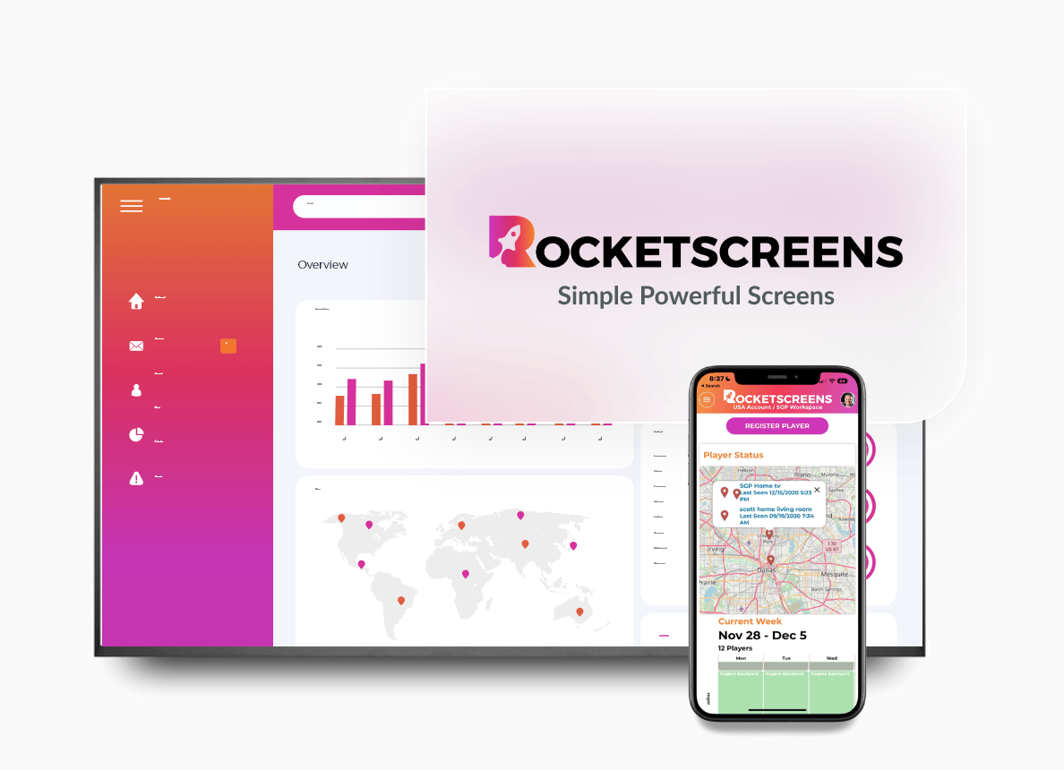
Getting your sensitive and complex Power BI reports onto screens might seem complicated, but modern platforms have made it straightforward and secure. RocketScreens is designed for exactly this purpose.
Secure, Seamless Integration
RocketScreens offers a direct, secure integration with Microsoft Power BI. This isn't a clunky workaround like screen-casting a laptop. You simply authenticate your Power BI account within RocketScreens, and you can instantly select which reports or dashboards you want to display. The connection is secure, respecting all the permissions you've set within Power BI, ensuring sensitive data is only shown on the appropriate screens.
Display Anywhere
Once connected, you can push your HR dashboards to any screen, anywhere.
- Show high-level company-wide metrics in the lobby.
- Display department-specific KPIs on screens in that team's area.
- Share engagement scores and kudos in the cafeteria.
- Broadcast safety and training stats on the manufacturing floor.
More Than Just Dashboards
The real strength comes from context. With RocketScreens, your Power BI HR report doesn't have to live in isolation. You can add it to a playlist that includes other vital company information. For example, a channel for the sales floor could rotate between the live sales leaderboard from your CRM, the Performance Management dashboard from Power BI, and a company-wide announcement. RocketScreens connects to over 100 applications, allowing you to blend HR data with content from social media, news feeds, Google Slides, and more, creating a rich and engaging communication channel.
Putting It All Together: A Blueprint for Data-Driven HR
Transforming your HR function into a strategic, data-powered department is a process. Here is a simple blueprint to follow:
- Define Your Goals: Before you build anything, determine what you want to achieve. Do you need to reduce turnover? Improve hiring efficiency? Increase employee engagement? Start with the business problem.
- Consolidate and Clean Your Data: Identify your data sources (HRIS, ATS, etc.) and ensure the data is accurate. This is the foundational work required for any meaningful analysis.
- Build Your Power BI Reports: Start with one of the key reports mentioned above, like Workforce Analytics or Recruitment. Focus on creating clear, easy-to-understand visuals that directly address your goals.
- Share for Impact with RocketScreens: Don't let your insights stay hidden. Connect your Power BI account to RocketScreens and strategically display your dashboards throughout the workplace. Communicate what the data means and celebrate the progress you make.
By combining the analytical power of Power BI with the communication reach of RocketScreens, you create a complete ecosystem for HR data. You move from simply reporting the past to actively shaping a better future for your organization and its people.


