Most companies are not short on data. They are buried in it.
Weekly PDFs, shared spreadsheets, BI links no one opens, dashboards that live behind logins. Teams spend hours creating reports, yet targets still slip and surprises still show up at the end of the month.
The problem is not the data itself. It is how people see it.
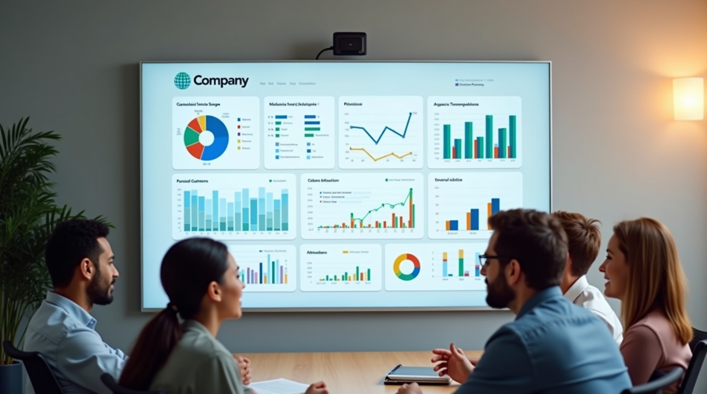
When metrics live inside reports, they demand effort and intention. When metrics live on screens, they quietly shape behavior all day. TV dashboards and digital signage close a visibility gap that reports never can. Once data is always visible, it stops being a document and starts acting like a scoreboard.
Reports vs Dashboards: What’s Really Different?
On paper, reports and dashboards can contain the same numbers. In practice, they behave very differently.
Traditional reports usually look like:
- PDFs attached to emails
- Spreadsheets with tabs and filters
- In-tool reports inside CRM or BI platforms
They follow a pull model. Someone has to remember to open them, spend time reading them, and mentally connect the numbers to what they should do next. Most reports are reviewed days after the data was generated.
Dashboards change the delivery.
Dashboards are visual, live, and scannable. When they are placed on wall-mounted TVs or shared office screens, they move from pull to push.
Key differences that matter:
- Reports are slow to consume and easy to postpone
- Dashboards are quick to read and hard to ignore
- Reports often show historical snapshots
- TV dashboards surface what is happening now
The delivery mode is as important as the data itself. A KPI hidden in a tool might as well not exist for day-to-day decisions.
The Psychology of Seeing Metrics (Not Reading Them)
The reason TV dashboards work is not trendy design. It is basic human psychology.
How the brain loves visuals
The human brain processes visual information faster than text. Patterns, shapes, color, and position are handled almost instantly, before conscious thought kicks in.
A red bar dropping below target or a green progress bar moving forward registers in seconds. A table of numbers demands focus, memory, and interpretation.
Visual elements such as:
- Color changes
- Bar lengths
- Trend arrows
- Position on a leaderboard
...allow people to spot meaning without reading. This is why data visualization psychology matters. Good visuals lower cognitive load. People do not have to work to understand what matters.
Why text-heavy reports get ignored
Reports ask for time and attention at the exact moment people have the least of both. Emails pile up. Dashboards inside tools compete with daily tasks. Tables and long explanations feel like homework. So, people delay. They skim. They plan to look later. By the time the report is reviewed, the opportunity to act has often passed.
Emotion, motivation, and visual feedback
Visual metrics do something else that reports do not. They trigger emotion.
Progress bars feel like progress. Leaderboards feel like competition. Trend lines feel like momentum or danger. This turns metrics into feedback, not just information.
Think about the difference between:
- A spreadsheet with 50 rows of sales numbers
- A TV screen showing quota progress and today’s wins
One informs. The other changes behavior the same day.
Why Data Visibility Matters More Than Data Volume
Many teams already track the right KPIs. They just hide them.
The hidden cost of invisible data
Sales, support, and ops teams often have solid dashboards inside tools like CRMs and BI platforms. The problem is access.
If metrics are only reviewed in weekly meetings, they become a report card. Teams react after results are locked in.
Invisible data leads to:
- Slower response times
- Missed warning signs
- Overreliance on status meetings
Visibility drives alignment and accountability
When KPIs are visible to everyone, they create a shared reality. No one has to ask what matters. The screen answers that question all day.
Public metrics also change social behavior:
- People feel accountable when performance is visible
- Healthy competition shows up through leaderboards
- Wins get noticed instead of buried in emails
This is where data-driven culture and scoreboards meet psychology.
Real-time screens vs static snapshots
Static reports tell you what happened. Real-time screens show you what is happening. TV dashboards surface spikes, dips, and bottlenecks as they occur. That makes action cheaper and faster. Problems caught early are easier to fix than problems discovered in a weekly review.
How TV Dashboards Turn Metrics into a Daily Habit
Digital signage changes the relationship people have with data.
From checking dashboards to living with dashboards
Opening a dashboard is a task. Seeing a dashboard is a habit.
When metrics live on office TV dashboards, people absorb them without effort. Walking past a screen becomes a constant, low-friction check-in. This ambient awareness influences conversations, priorities, and decisions without formal meetings.
The social psychology of screens in shared spaces
Shared screens make metrics part of the environment. Sales boards, queues, and KPIs stop belonging to managers and start belonging to the team.
Social comparison plays a role here. Seeing names on leaderboards or progress bars next to goals creates motivation that private reports cannot. Recognition works the same way. Public wins feel bigger than private congratulations.
Fewer status meetings, more action
When current performance is visible, many status meetings lose their purpose. Teams already know where they stand. Meeting time can shift from reviewing numbers to fixing problems. That is a quiet productivity gain most teams underestimate.
Where Companies Use TV Dashboards Today
Office TV dashboards are not limited to one department.
Sales teams
Common metrics on sales screens include:
- Pipeline value and movement
- Deals closed today or this week
- Quota progress by rep or team
- Activity leaderboards
Displaying CRM dashboards on TVs keeps targets front and center and turns progress into a shared experience.
Support and operations
Support and ops teams rely on speed and awareness. Typical metrics shown on screens:
- Live ticket queues
- SLA countdowns
- First-response and resolution times
- Incident status and uptime
When queues spike or SLAs approach breach, teams can react immediately.
Project and production floors
For delivery and operations teams, visibility reduces friction. Screens often show:
- Sprint progress and burndown charts
- Task completion rates
- Production throughput
- Downtime and quality metrics
Factory floors and warehouses use BI dashboards on TVs to keep teams aligned without constant check-ins.
Marketing and leadership
Leadership screens focus on business health. Common metrics include:
- Website traffic and lead flow
- Campaign performance and ROAS
- Revenue, churn, and retention
- Company-wide goal progress
These screens help leadership teams spot trends without digging through reports.
Introducing RocketScreens: Bringing Your Metrics to Every Screen
At this point, the psychology is clear. Visibility drives behavior. The next question is how to do it without rebuilding your reporting stack.
What RocketScreens does
RocketScreens is a digital signage platform built to show live metrics where people actually see them. It connects with over 100 tools and platforms, allowing teams to display dashboards and KPIs on TVs, desktops, and remote screens.
You can combine dashboards, leaderboards, announcements, and media into channels and broadcast them across offices or locations.
How it supports the psychology of visible metrics
RocketScreens is designed around how people respond to visible data. Key elements that matter:
- Auto-refreshing dashboards keep data current and trusted
- Leaderboards turn metrics into social signals
- Flexible layouts ensure critical KPIs stand out
- Scheduling lets teams show the right data at the right time
RocketRankings, in particular, helps teams turn CRM data into live leaderboards that tap into accountability and recognition.
Real examples of what to show on RocketScreens
Teams use RocketScreens to display:
- Sales leaderboards by revenue or deals closed
- Live support queues and SLA timers
- Production and downtime metrics from BI dashboards
- Company goal progress and recognition boards
The goal is not to show everything. It is to show what drives action today.
Getting Started: Turn Your Reports into Visible TV Dashboards
Making the shift from reports to screens is simpler than most teams expect.
- Step 1: Choose must-see metrics
Identify a small set of KPIs that influence daily behavior for each team. - Step 2: Visualize them clearly
Use your existing tools to build clean, scannable dashboards. Focus on clarity, not detail. - Step 3: Connect to RocketScreens
Link your dashboards and create channels that group related metrics. - Step 4: Control placement and timing
Assign channels to office TVs and set rotations so important metrics stay visible. - Step 5: Treat screens as living scoreboards
Review what people notice and respond to. Adjust layouts and metrics as priorities change.
When data is visible, behavior follows. RocketScreens helps teams turn Salesforce, Power BI, and other dashboards into live TV dashboards that people actually notice, understand, and act on.
FAQs
Why do visual dashboards work better than written reports?
Visual dashboards use fast visual processing in the brain, making trends and problems obvious at a glance without the effort required to read dense reports.
Do I still need detailed reports if I use TV dashboards?
Yes. Reports are useful for deep analysis. TV dashboards keep everyone aligned day to day by showing key metrics continuously.
Which metrics should I put on office TV screens?
Focus on KPIs that drive behavior, such as sales progress, support queues, SLA status, and top-level business health.
Can RocketScreens display dashboards from existing tools?
Yes. RocketScreens connects with over 100 platforms, so teams can reuse the dashboards they already rely on.
How do TV dashboards affect team motivation and culture?
Visible performance increases accountability, recognition, and healthy competition, especially when leaderboards and wins are public.
Is it hard to set up TV dashboards with RocketScreens?
Setup is straightforward. Connect your tools, build channels, and assign them to screens using simple controls.